P.02 · Bandcamp · Music & CommerceCase study

Bandcamp Redesign

Lead Product Designer · 2023

Cover · F/02
↳ 01 / Brief

The premise.

Bandcamp is an online record store and community: fans discover, listen, and support artists directly. This case study is a structured heuristic evaluation of the mobile app against Nielsen’s 10 usability heuristics, with redesign proposals tied back to each violation—so recommendations stay accountable to a shared UX vocabulary, not taste alone.

The strategy was simple: translate Bandcamp’s mission into three user intents—discover new music, stay connected through listening, and purchase to support—then score friction by whether it broke discovery, listening, or purchase. Where the app obscured system state, hid navigation, or overloaded choice at checkout, the redesign targets the smallest interaction that restores predictability on a phone.

Mobile is the real stage. Industry listening surveys consistently show smartphones leading as the primary device for digital audio—while laptop listening trails—so layout, feedback, and purchase clarity on small screens are not edge cases; they are the product.

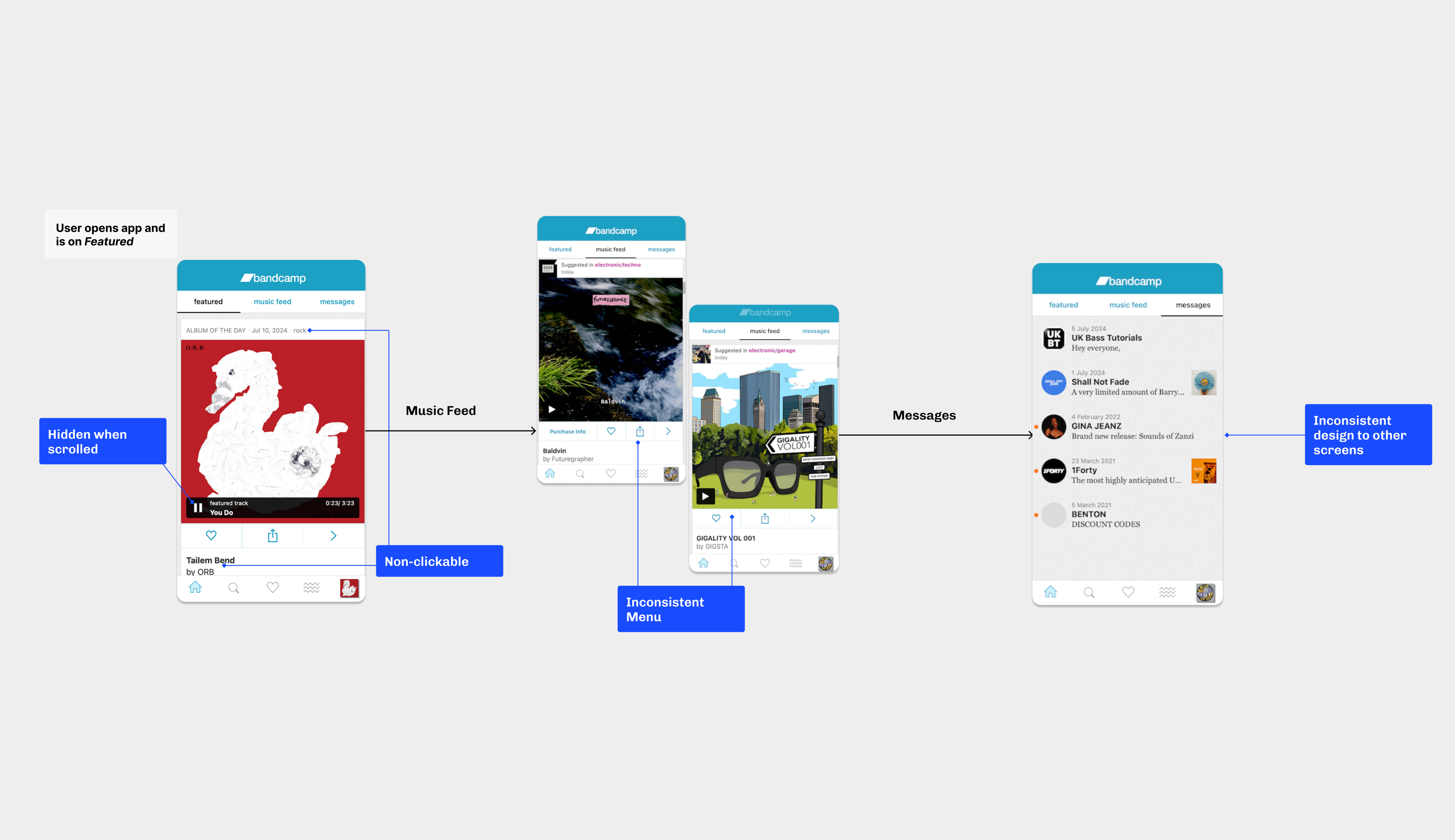
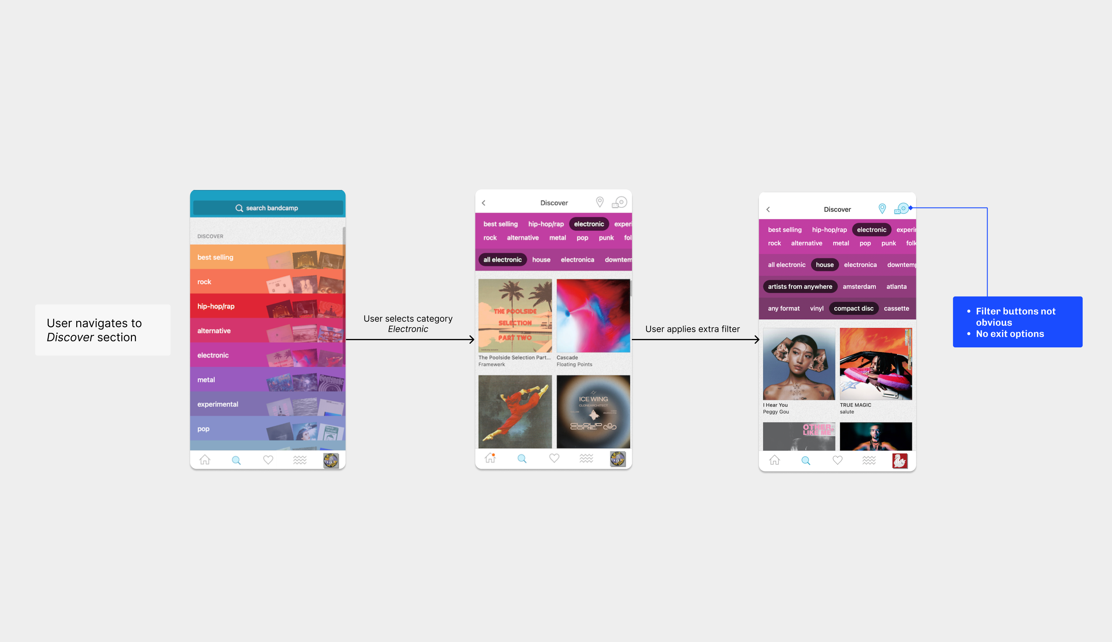
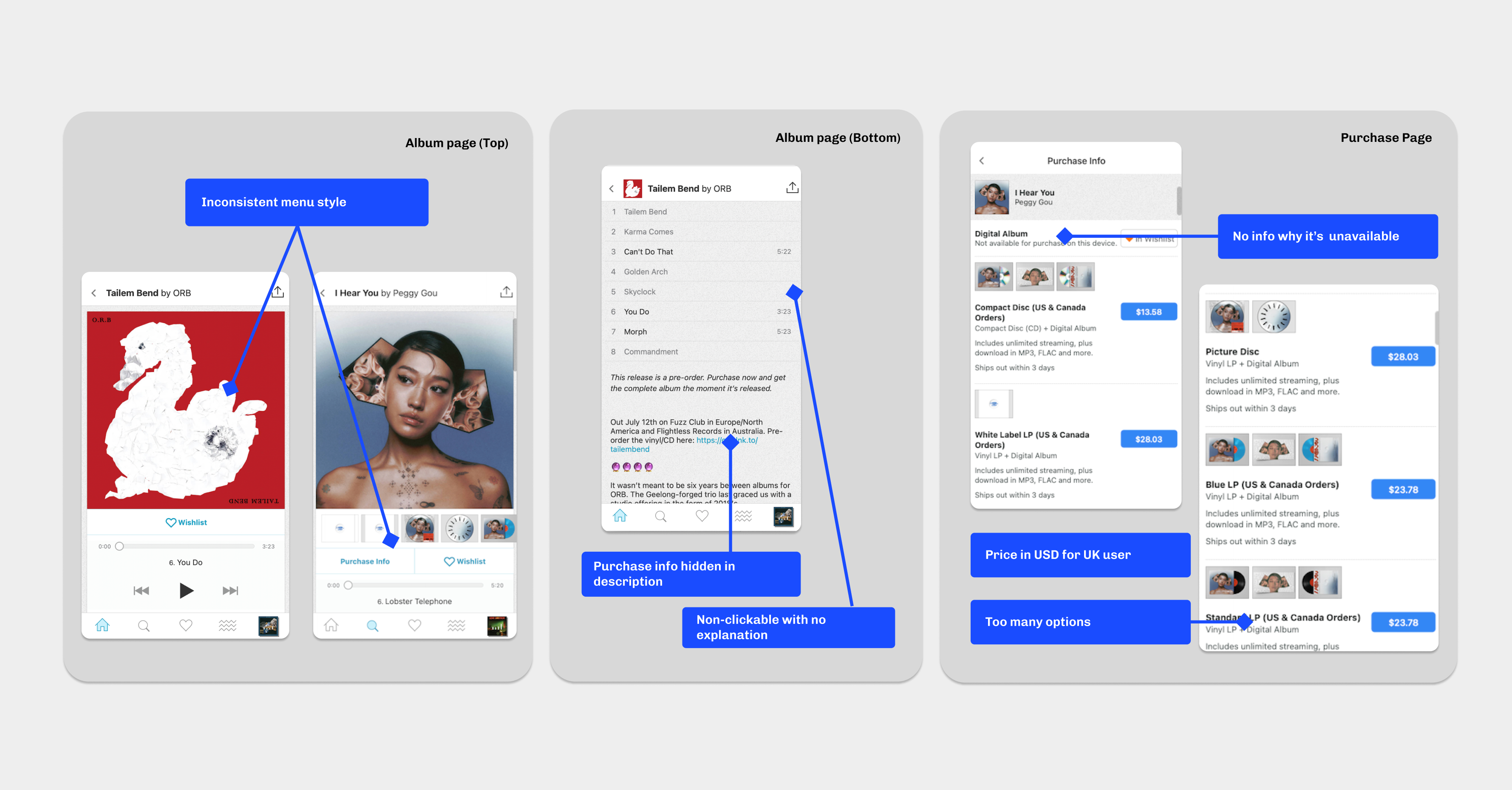
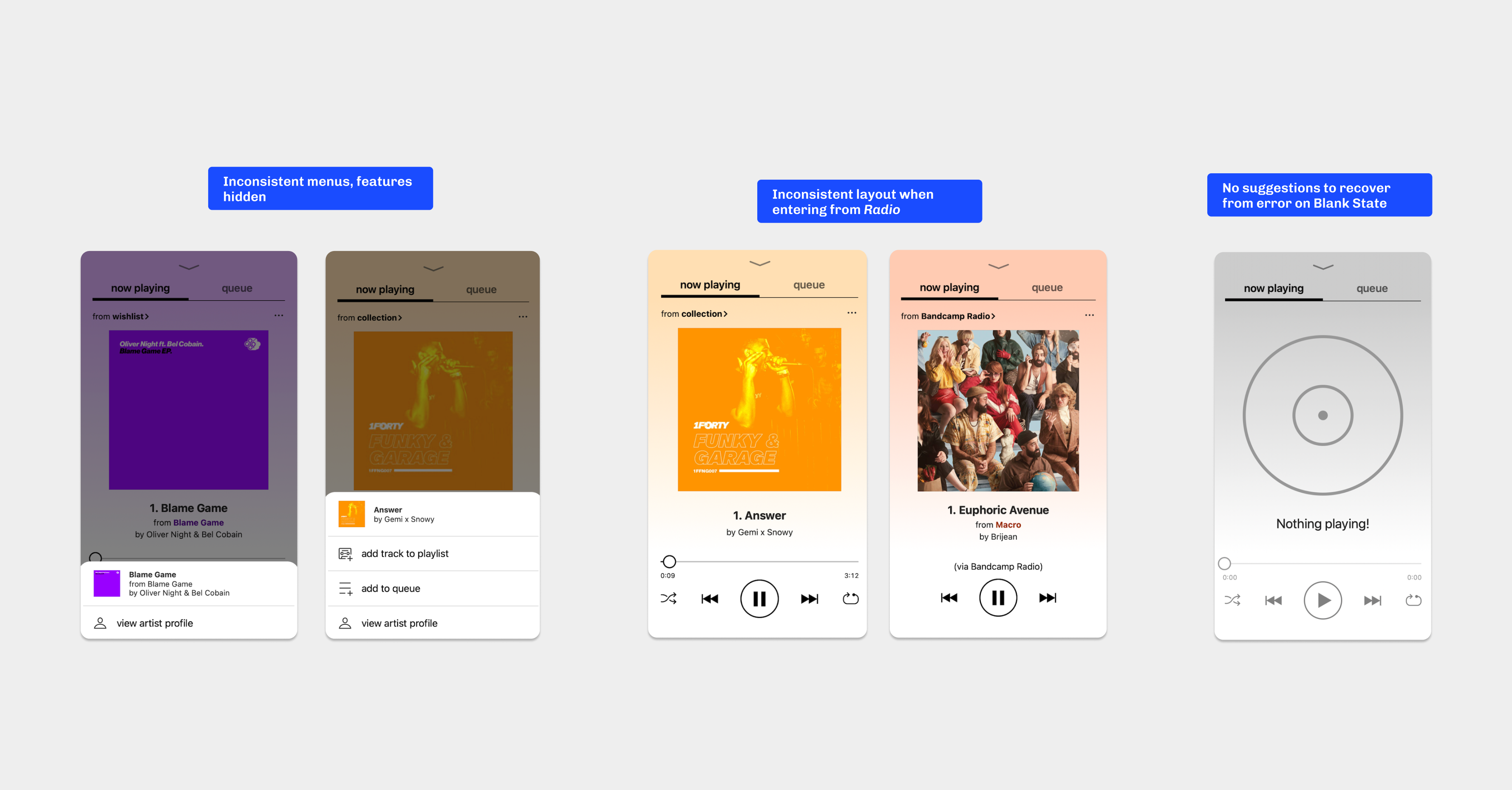
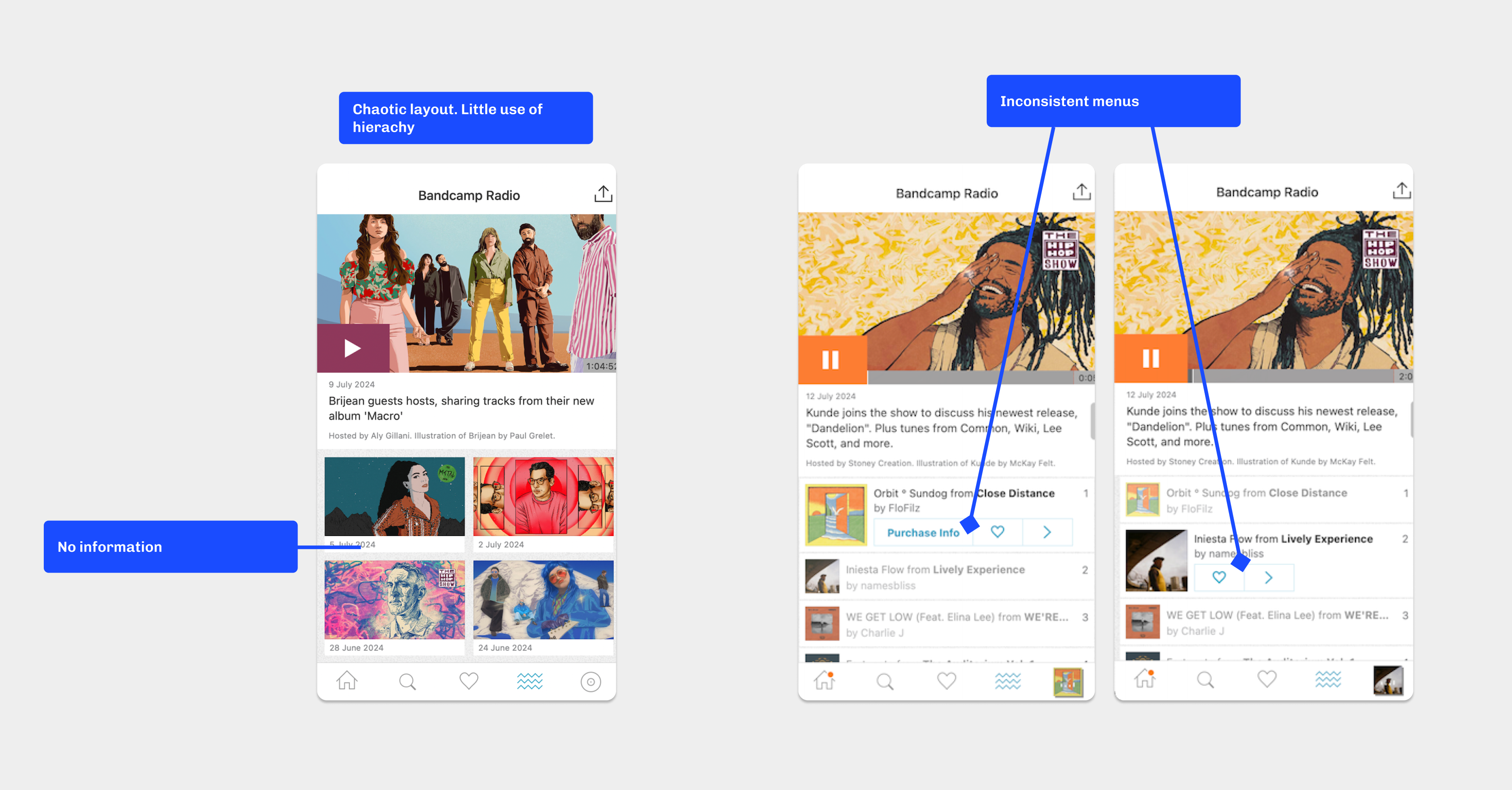
Across five surfaces—Homepage, Discover, Album, Now Playing, and Bandcamp Radio—the same pattern appeared: the rules are implicit. The modules below pair each area’s “before” capture with a motion study of the proposed “after,” stacking evidence the way a critique desk would: problem first, intervention second, ship-ready detail in the captions.

↳ 02 / Component Breakdowns

The system, in pieces.

M/011 | Homepagesystem
BeforeStatic
1 | Homepage — before
AfterMotion

Problem: the Now Playing bar disappears on scroll, so users lose orientation on what’s playing and it’s harder to stay in a listening flow. Featured treats genres, artists, and tracks as static—curiosity has nowhere to go—and menus drift between Featured, Music Feed, and Messages. Solution: a sticky Now Playing rail, consistent menus with a modal when purchase isn’t on-device (routing people back into discovery), and card-based Messages to match the other feeds.

M/022 | Discoverflow
BeforeStatic
2 | Discover — before
AfterMotion

Problem: top-right filters read ambiguous—hard to tell what they do or whether they’re on—so discovery stalls; clearing filters and search memory are weak. Solution: location and format controls brought into thumb-friendly positions with obvious state, a dedicated clear-filters affordance, and recently searched to support recognition over recall.

M/033 | Album Pageflow
BeforeStatic
3 | Album Page — before
AfterMotion

Problem: tracks look arbitrarily unpurchasable, menus feel inconsistent, and checkout throws a long list of options and currencies with little explanation—especially why digital purchase doesn’t resolve on mobile. Solution: lock icons plus a short modal on gated playback, purchase options grouped by format to reduce load, and explicit copy on desktop-only digital downloads (and the platform constraints behind that).

M/044 | Now Playingsystem
BeforeStatic
4 | Now Playing — before
AfterMotion

Problem: mixed owned vs. wishlist vs. unowned playback hides the rules—queues and playlists feel missing without explanation; Radio lacks scrubbing despite not being live; empty states don’t help recovery. Solution: surface queue and playlist on owned tracks, wishlist and lock affordances on unowned tracks with an explainer modal, and clearer recovery paths when the system says no.

M/055 | Bandcamp Radiotype
BeforeStatic
5 | Bandcamp Radio — before
AfterMotion

Problem: the Radio surface overwhelms—unclear whether you’re hearing talk or music, little sense of past episodes, weak typographic hierarchy, and the same inconsistent purchase menus. Solution: tighter hierarchy, labels, and modals so the format reads quickly and listening is the default action.